
Mobile commerce in South Africa: why mobile-first isn’t optional
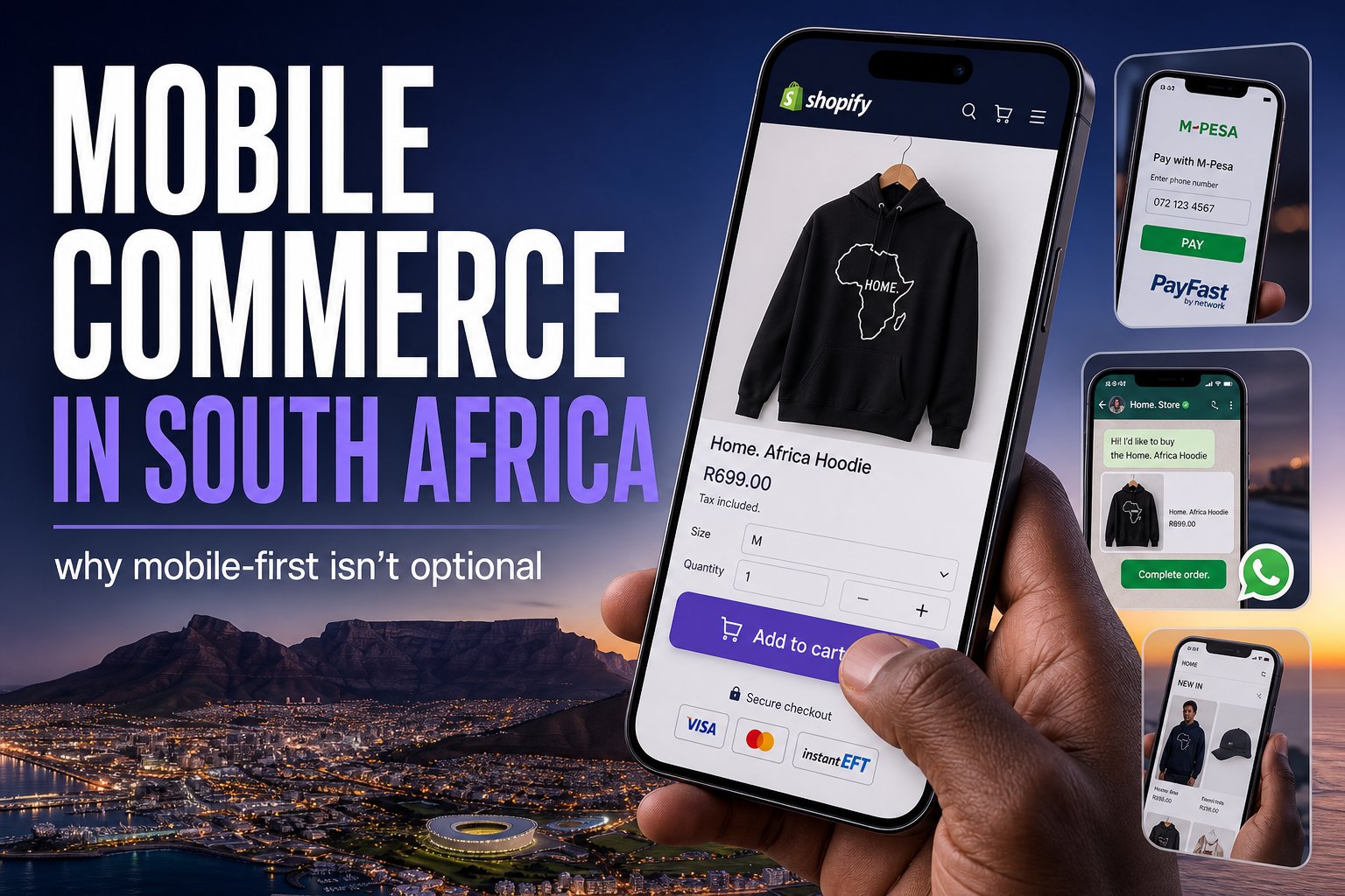
Most of your South African customers are shopping on a phone, often on mobile data, sometimes on a patchy connection. If your store isn’t built mobile-first, you’re losing the majority of your visitors before they see your products. Here’s what mobile-first actually means for an SA store.
There’s a gap between how store owners shop and how their customers do. Owners build and admire their store on a desktop. Their customers — the large majority of them in South Africa — are on a phone, frequently on mobile data, sometimes on a slow or expensive connection. If your store looks great on your laptop but is slow or fiddly on a mid-range Android phone, you’re losing most of your traffic before it ever reaches a product. Mobile-first isn’t a nice-to-have in SA; it’s the default reality of your audience.
This guide covers why mobile dominates SA ecommerce, what “mobile-first” actually means in practice, the SA-specific constraints (data costs, device range, connectivity), and how to make sure your store works for the customers you actually have. It connects directly to our conversion guide and Shopify SEO guide.
Why mobile dominates SA ecommerce
South Africa is a mobile-first internet market. Many South Africans access the internet primarily — often exclusively — through a smartphone rather than a desktop computer. Data is relatively expensive, connections vary widely in quality, and the device range skews toward mid- and entry-level Android phones rather than the latest iPhones. The practical upshot: the typical SA online shopper is browsing your store on a phone screen, mindful of data, possibly on a less-than-perfect connection. Design for that person, not for the desktop you built the store on.
What “mobile-first” actually means
Mobile-first isn’t just “it works on a phone” — it means the mobile experience is the priority, designed first and best, with desktop as the secondary view. In practice:
- Speed above all. On mobile data and mid-range devices, speed is everything. Heavy images, bloated apps and clunky themes punish mobile users hardest. A fast store respects the customer’s data and patience — and Google’s mobile-first ranking.
- Thumb-friendly design. Buttons and tap targets big enough for a thumb, key actions within easy reach, no tiny links crammed together. Navigation that works one-handed.
- A checkout that works on a phone. Short, simple, with minimal typing. Guest checkout, autofill-friendly fields, and mobile-friendly payment options. Every extra field is harder on a phone.
- Readable without zooming. Legible font sizes, enough contrast, content that reflows to the screen — no pinch-and-zoom to read a product description.
- Images that load fast but still sell. Properly compressed and sized for mobile, so they look good without eating data or time.
The SA-specific constraints to design for
- Data cost-consciousness. Many SA shoppers are mindful of data usage. A bloated store that burns megabytes loading is a store people leave — and may resent. Lean, efficient pages are a courtesy that converts.
- Variable connection quality. Not everyone is on fast fibre or strong LTE. Your store should still function on a slower connection — which again comes back to speed and efficiency.
- Mid-range device performance. Test on an actual mid-range Android, not just the latest flagship. Heavy JavaScript and animations that are smooth on a new iPhone can stutter on the devices many customers actually use.
- Load-shedding reality. Connectivity can be interrupted. A fast, resilient store that loads quickly in the windows people have is more forgiving than a heavy one.
SA constraints and what to build for each
Every row comes back to speed and efficiency.
| Constraint | Design response |
|---|---|
| Data costs | Lean pages; compressed, right-sized images |
| Variable connections | A store that still works on a slower connection |
| Mid-range Android phones | Light JavaScript and animation; test on a mid-range device, not a flagship |
| Load-shedding | Fast pages that load in the windows people have |
How to make your store genuinely mobile-first
- Test on real phones, on data. The single most useful habit: go through your whole store — browse, search, add to cart, checkout — on a mid-range phone on mobile data, not your office wifi. You’ll find the problems your customers hit.
- Obsess over speed. Compress and right-size images (the number-one cause of slow stores), keep your app stack lean (each app can add scripts that slow mobile most), and choose a well-built, lightweight theme.
- Simplify the mobile checkout. Fewer steps, less typing, guest checkout, mobile-friendly payments. This is where mobile carts are won or lost — see cart recovery.
- Design for thumbs. Big tap targets, reachable buttons, simple one-handed navigation.
- Prioritise the mobile layout. When something can’t be perfect on both, make it perfect on mobile. That’s where your customers are.
- Consider WhatsApp. Since your customers live on their phones and on WhatsApp, offering WhatsApp contact and support fits how SA mobile shoppers already behave.
Test the whole journey on a mid-range phone
On mobile data, not office wifi. What to check at each step.
Mobile and SEO are the same fight
A bonus: optimising for mobile also optimises for Google. Google uses mobile-first indexing — it ranks based on your mobile site — and page experience (speed, mobile usability) is a ranking factor. So the work that makes your store convert better on phones also helps it rank, and vice versa. A fast, clean, mobile-friendly store wins twice: more visitors from search, more of them converting. It’s the same fight, covered from the ranking side in our Shopify SEO guide.
Frequently asked questions
The bottom line
In South Africa, mobile isn’t a segment of your audience — it’s the majority of it, shopping on phones, on data, on variable connections. Mobile-first means designing the phone experience first and best: obsessive speed, thumb-friendly design, a simple mobile checkout, and lean pages that respect data and weaker connections. Test on a real mid-range phone on mobile data, fix what you find, and you’ll convert more of the customers you actually have — while ranking better in Google’s mobile-first index at the same time.
If you’d like your store audited and built for how SA customers really shop — fast, mobile-first, and conversion-focused — that’s central to everything we build. Pair this with the conversion guide to turn that mobile traffic into sales.

We have built 400+ online stores for South African businesses since 2014. Read more about eCommerce development in South Africa.